Every MyIQ report is built the same way, so once you can drive one you can drive all of them. This section covers the controls; section 4 covers what each individual report is for.
3.1 The anatomy of a report page
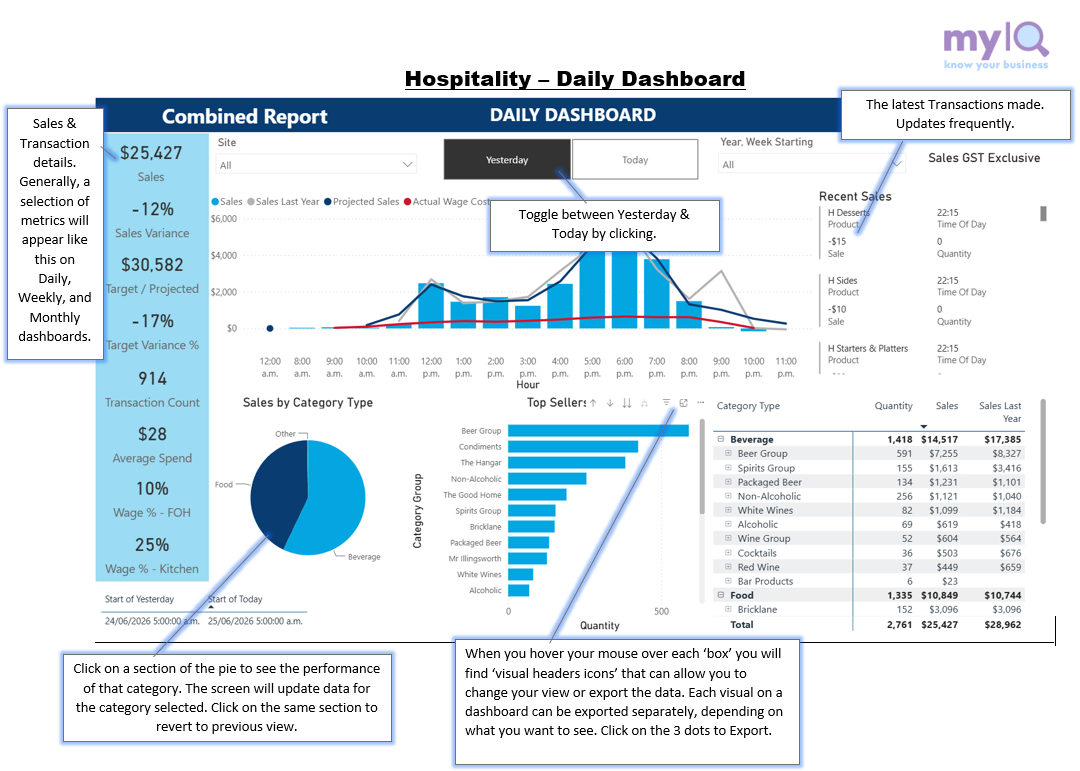
The Daily Dashboard, showing the five parts every MyIQ report shares.
Reading down the page:
| Part | What it does |
|---|---|
| Title bar | The dark blue band. On the left, the report workspace (here "Combined Report"); in the centre, the report name. |
| Slicer row | The filters that control the whole page — Site, period, and whatever else that report needs. Set these first. |
| KPI strip | The pale blue column of headline numbers down the left. These respond to every filter and selection you make. |
| Visuals | The charts and tables. Clicking one filters the others. |
| Footer stamps | Small date and time fields at the bottom telling you exactly which period the report is covering and when the data last refreshed. |
3.2 The KPI strip
The pale blue column on the left of most dashboards carries the headline figures — the numbers you would quote in a morning meeting. The large figure is the value; the small grey word underneath is what it is.
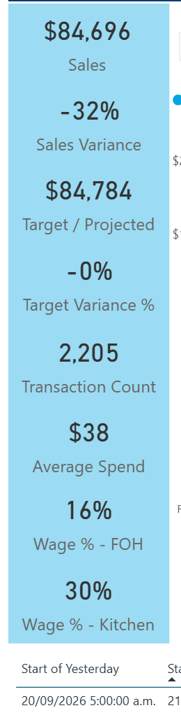
The Daily Dashboard KPI strip.
Colour is used consistently across the whole suite:
Green means the variance is in your favour — sales ahead, or cost below target.
Red means it is against you.
Black or dark grey is a plain value with no judgement attached — a count, an average, a dollar total.
The KPI strip is not static. Click a slice of a pie or a bar in a chart and these figures recalculate for just that selection, which is the fastest way to answer "how much of that was beverage?".
3.3 Slicers
Slicers are the dropdowns along the top of the page. They filter everything on the page at once.
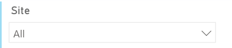
A closed slicer. "All" means no filter is applied.
Click the arrow on the right to open it.
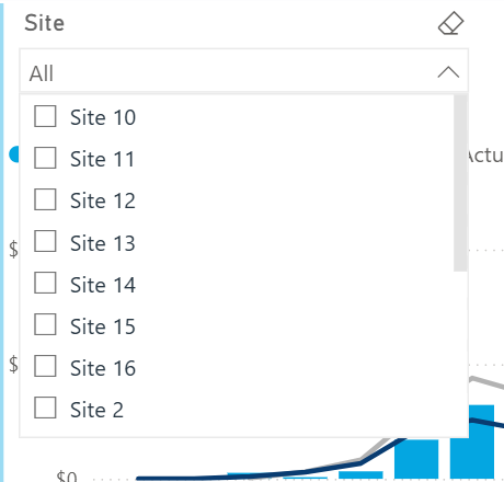
The Site slicer open, with a tick box for each site.
Click the arrow to open the list.
Tick one or more items. Ticking nothing is the same as "All".
Click the arrow again to close the list. The report updates as you go.
To select several items, just tick each one — MyIQ slicers are multi-select, so you do not need to hold Ctrl. To clear a slicer, untick everything, or use the eraser icon that appears at the top right of the slicer when you hover over it.
Slicers stack
Filters combine. Site 12 plus Beverage plus Friday gives you beverage sales at Site 12 on Fridays — not all three added together.
If a report suddenly looks wrong, the first thing to check is what is still ticked in the slicers further along the row. It is easy to leave one set.
3.4 Period buttons
Most dashboards have a pair or a trio of buttons instead of a date slicer. The dark button is the one currently selected.

Yesterday / Today on the Daily Dashboard.

Last Week / This Week / Next Week on Daily Wage Costs.
Which pair you get depends on the report: Yesterday / Today on daily reports, Last Week / This Week on weekly ones, Last Month / This Month on monthly ones. Daily Wage Costs adds Next Week so you can look at the roster before it is worked.
Yesterday versus Today
Yesterday is settled, loaded data — the trading day is finished and every transaction is in.
Today is live and still filling up through the day. A Today figure at 10am is not a bad day; it is an incomplete one. Compare Today only with the same point in a previous day, never with a full day.
3.5 Date range boxes
Reports that look across longer periods give you two date boxes instead of buttons.

Excl GST / Incl GST on the Daily Report, with the current basis stated on the right.
Some reports let you switch between GST-exclusive and GST-inclusive figures. Whichever you pick, the report states the basis in plain text on the right of the slicer row — check it before quoting a number to anyone.
3.7 Tooltips
Hover the mouse over any bar, line point or slice and a small panel appears with the exact figures behind it.
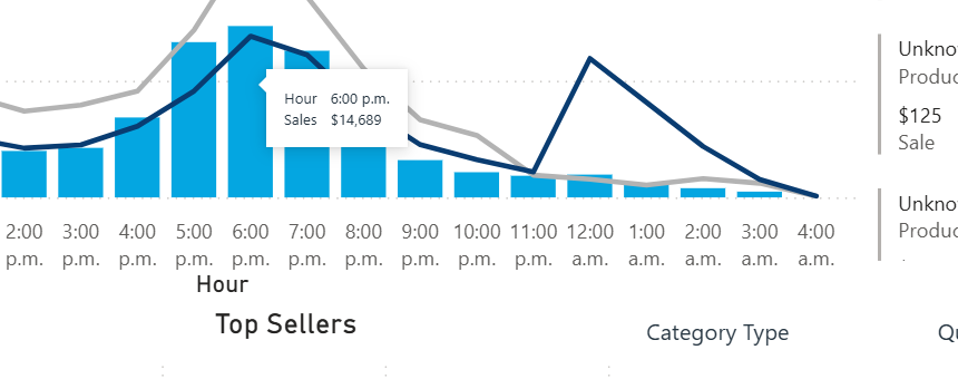
Hovering the 6:00 p.m. bar on Sales by Hour.
Tooltips are the quickest way to read a chart precisely without exporting anything. Move the mouse away and the tooltip disappears.
3.8 Clicking to filter
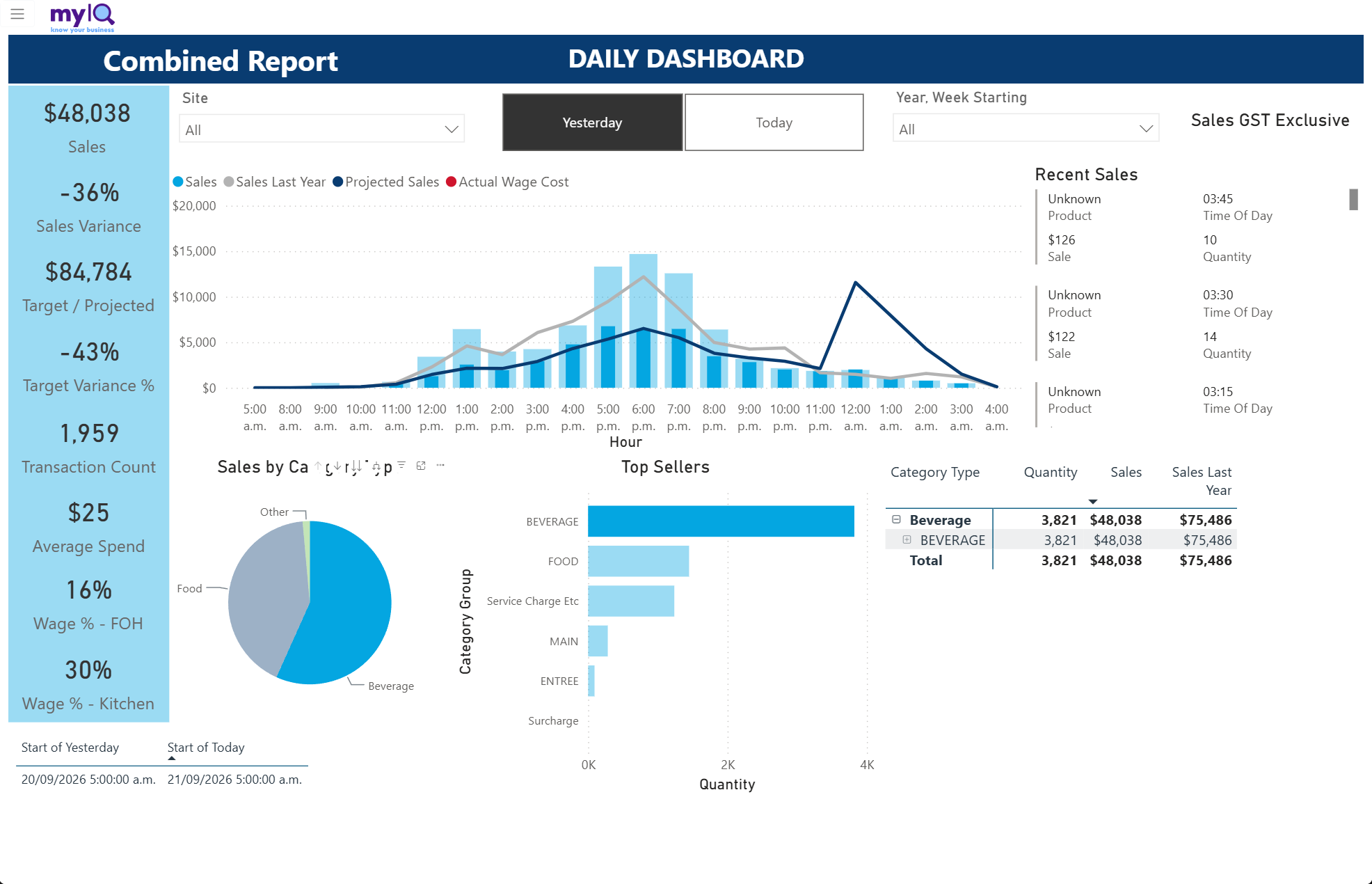
Clicking a bar, a slice or a table row filters the rest of the page to that selection. This is the single most useful thing to know about a Power BI report.
Clicking the Beverage slice: the KPI strip now shows beverage only ($48,038 and 1,959 transactions), the hourly bars are shaded to show beverage as a share of each hour, and the table is filtered to Beverage.
Note what happens to the Sales by Hour chart. The bars are not replaced — they are shaded, with the solid part showing the selected category and the pale part showing everything else. That lets you see both the share and the total at once.
To clear a selection, click the same item again, or click any empty white space on the page. If the numbers look oddly small, an unnoticed selection is the usual cause.
Click one item to select it.
Ctrl+click to add more items to the selection.
Click it again, or click empty space, to clear.
3.9 Tables and matrices
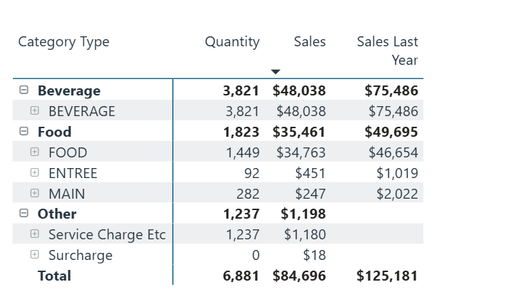
A matrix with expandable rows. The minus boxes collapse a group; the plus boxes open the level below.
Expand and collapse. A plus box next to a row opens the level below it — category into sub-category, site into department. A minus box closes it again.
Sort. Click a column heading to sort by it; click again to reverse. A small arrow next to the heading shows which column the table is currently sorted on and in which direction.
Scroll. Long tables have their own scrollbar that appears on the right when you hover over them. The Total row stays pinned at the bottom and always reflects the whole table, not just the rows you can see.
3.10 The visual header icons
Hover over any chart or table and a small row of icons appears above its top-right corner. They apply to that one visual, not to the page.
Further details about the Visial Headers can be found

The header icons on a matrix. Charts show a subset of these.
| Icon | Name | What it does |
|---|---|---|
| ↑ ↓ | Sort ascending / descending | Sorts the visual by the currently chosen field. |
| ⇉ | Sort by | Chooses which field the visual sorts on. |
| ⑂ | Drill / hierarchy | Moves the visual up or down a level — category to product, month to day. Only appears where the visual has a hierarchy. |
| ☰ | Filters | Shows every filter currently affecting this visual, including ones set elsewhere on the page. Useful when a number looks wrong. |
| ⛶ | Focus mode | Expands the visual to fill the page. |
| … | More options | Opens the menu covered in 3.12 — Export data, Show as a table, Spotlight and sorting. |
3.11 Focus mode
Focus mode blows one visual up to fill the whole page. Use it when a table has too many rows to read, or when you want to show a single chart to someone.
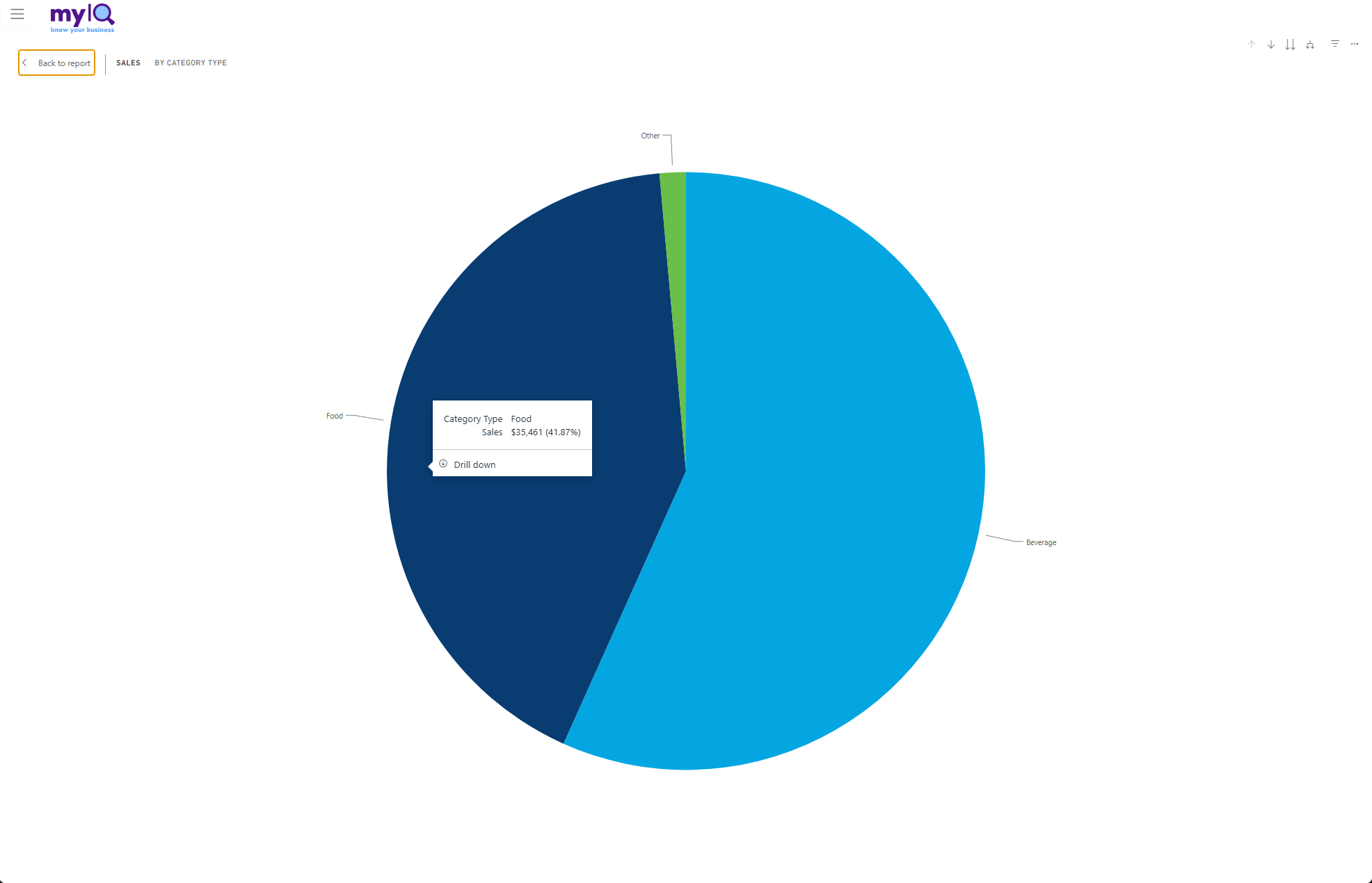
The Sales by Category Type pie in focus mode, with a tooltip open and the "Drill down" option showing.
Back to report at the top left returns you to the full page. Any filters or selections you had set are still in place.
3.12 Drill down
Some visuals have more than one level of detail behind them — category into sub-category into product, month into week into day.
Where drill-down is available, the tooltip carries a small Drill down option, as in the focus-mode screenshot above. Click it to move into the level below for the item you are hovering over. The drill icons in the visual header then let you move back up, or step down a level for everything at once rather than one item.
3.13 The More options menu
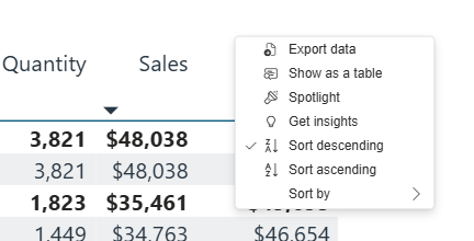
The More options menu on a matrix.
| Option | What it does |
|---|---|
| Export data | Sends the data behind this visual to Excel or CSV. Covered in 3.14. |
| Show as a table | Splits the screen and shows the chart with its underlying figures beneath it. A quick way to read exact values without exporting. |
| Spotlight | Dims every other visual on the page so this one stands out. Handy when presenting. |
| Get insights | Asks Power BI to look for notable patterns in the visual. Treat what it finds as a prompt to investigate, not as an answer. |
| Sort descending / ascending / Sort by | The same sorting controls as the header icons. |
3.14 Exporting to Excel
Exporting lets you work with the figures offline — filter them your own way, paste them into a pack, or send them to someone without a MyIQ login. It is particularly useful for the long detail tables such as Timesheets, Discounts and Sales vs Payments.
To export a visual
Set your slicers first. The export carries your current filters with it, so filter before you export rather than after.
Hover over the chart or table you want.
Click the … (More options) icon above its top-right corner.
Choose Export data.
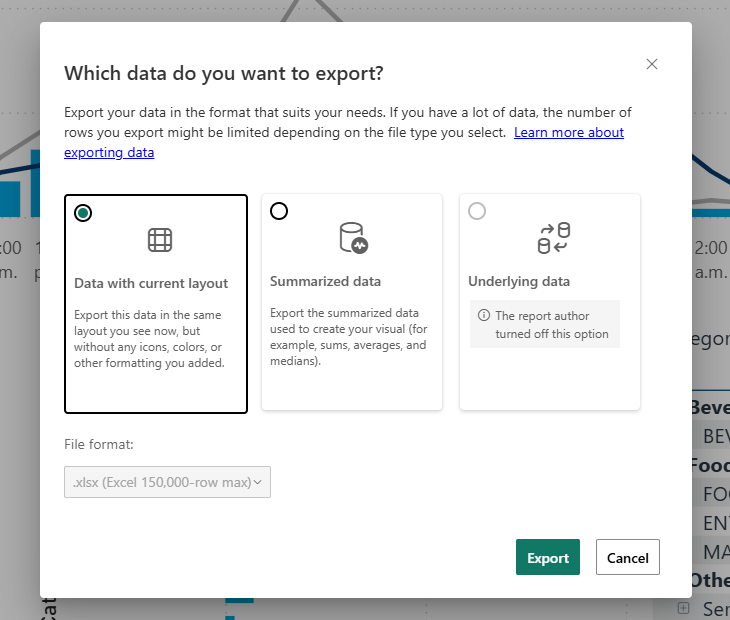
The export dialog.
Choose what to export, then click Export.
| Option | When to use it |
|---|---|
| Data with current layout | Gives you the table as you see it on screen, including the grouping and the column order. Best when you want something that looks like the report. |
| Summarized data | Gives you the underlying summarised rows — the figures the visual was built from — as a flat table. Best when you intend to filter, pivot or re-sort the data yourself. |
| Underlying data | Transaction-level detail. This is switched off in MyIQ reports and will appear greyed out. |
The file format defaults to .xlsx with a 150,000-row limit. If your export would be larger than that, narrow the period or the sites first.
Working with the export in Excel
The exported sheet comes through as a proper Excel table with filter arrows on each column heading, so you can slice it further without any setup.
Click the arrow on the column you want to filter — for example Department.
Click (Select All) to clear every tick.
Tick just the values you want, then click OK.
Repeat on other columns to narrow it further, or use the same menu to re-sort.
Exports are a snapshot
An exported file is the data as it stood at the moment you exported it. It does not refresh. Re-export when you need current figures rather than reusing an old file.
3.15 How current is the data?

The footer stamps on the Daily Dashboard.
Small fields at the bottom of most reports tell you exactly which window the report is covering, and several reports also show when the data last loaded. The times come from MyIQ’s own clock rather than your computer, so everyone sees the same "today" regardless of where they are.
Two things are worth knowing:
The trading day does not start at midnight. In the demo it starts at 5:00 a.m., so late-night trading is counted against the day it belongs to rather than being split across two. Your site may use a different boundary.
Loaded and live data are different things. Everything up to the end of yesterday is loaded and settled. Today’s figures arrive through the day as trading happens.
3.16 If a report looks empty or wrong
Work through these in order — one of them explains almost every case.
| Symptom | Likely cause |
|---|---|
| The page is blank or nearly blank | The period has barely started. Several reports default to This Week or This Month; on a Monday morning that is a few hours of trading. Switch to Last Week or Last Month. |
| Figures are much smaller than expected | Something is still selected. Click any empty white space on the page to clear it, and check the slicers. |
| A site is missing | Either it is unticked in the Site slicer, or you do not have access to it. Check the slicer first. |
| A variance reads −100% | There is nothing in the current period to compare against yet, so the whole of the comparison figure shows as a shortfall. This is normal early in a period. |
| Gross profit looks wrong or is blank | Not every site reports reliable cost data, and those sites are deliberately excluded from GP figures. Check with your administrator whether the site is set to report GP. |
| Nothing loads at all | Refresh the browser page. If it persists, sign out and back in, then contact your administrator. |