This section covers each standard report in the order it appears on the menu. The three wage reports and Timesheets have a section of their own — see section 5.
Not every client has every report, and some clients have extras built for them. If a report on your menu is not here, the online help at docs.myiq.co.nz is the next place to look.
4.1 Daily Report
Answers: How did yesterday go, in profit-and-loss terms?
Use it when: First thing in the morning, or when a duty manager needs a single page that covers sales, cost of sales, wages and overheads together.
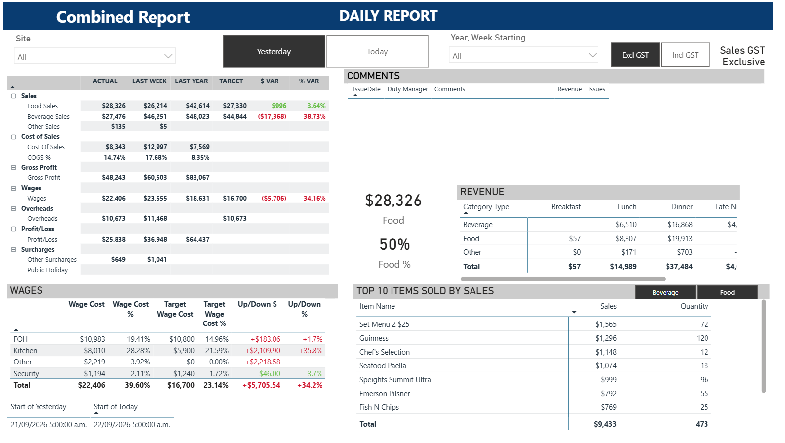
The Daily Report — a one-page trading statement for a single day.
Filters: Site, Yesterday / Today, Year & Week Starting, and an Excl GST / Incl GST toggle.
What is on the page
The trading statement on the left: Sales split into Food, Beverage and Other, then Cost of Sales, Gross Profit, Wages, Overheads, Profit/Loss and Surcharges. Each line is shown for Actual, Last Week, Last Year and Target, with the dollar and percentage variance against target.
The Wages table underneath, broken down by department — FOH, Kitchen, Other and Security in the demo — with wage cost, wage cost as a percentage of sales, the target for each, and the gap.
The Comments panel at the top right, where the duty manager’s notes for the day appear alongside any issues logged.
The Revenue table, splitting each category across dayparts — Breakfast, Lunch, Dinner and Late Night — with the food dollar value and food percentage called out beside it.
The Top 10 items sold by sales list, with a Beverage / Food toggle above it.
How to read it
Read the variance columns rather than the actuals. Green is in your favour, red is against you — so a red variance on the Wages row means wages ran over target, not under it.
The wage gap appears twice on this page, and the two blocks sign it differently. In the screenshot above the trading statement shows ($5,706) and the WAGES table shows +$5,705.54. Both are red and both say the same thing: wages ran about $5,700 over target. Quote the dollar figure and say "over" or "under" rather than repeating the sign.
The WAGES block is the fastest labour check in the suite: compare Wage Cost % against Target Wage Cost % for each department, and the Up/Down column gives you the size of the gap in dollars.
The daypart split in Revenue is where you find out whether a soft day was soft all day or only in one service.
Watch out for
The trading statement brackets an overspend as a negative; the WAGES table shows the same overspend as a positive. The colours agree, the signs do not.
The Comments panel is only populated if duty managers are entering notes. An empty panel means no notes were entered, not that nothing happened.
Check the Excl GST / Incl GST toggle before comparing against any figure from another system.
4.2 Daily Dashboard
Answers: What happened yesterday, and what is happening today?
Use it when: Every morning. It is the default landing page for most users.
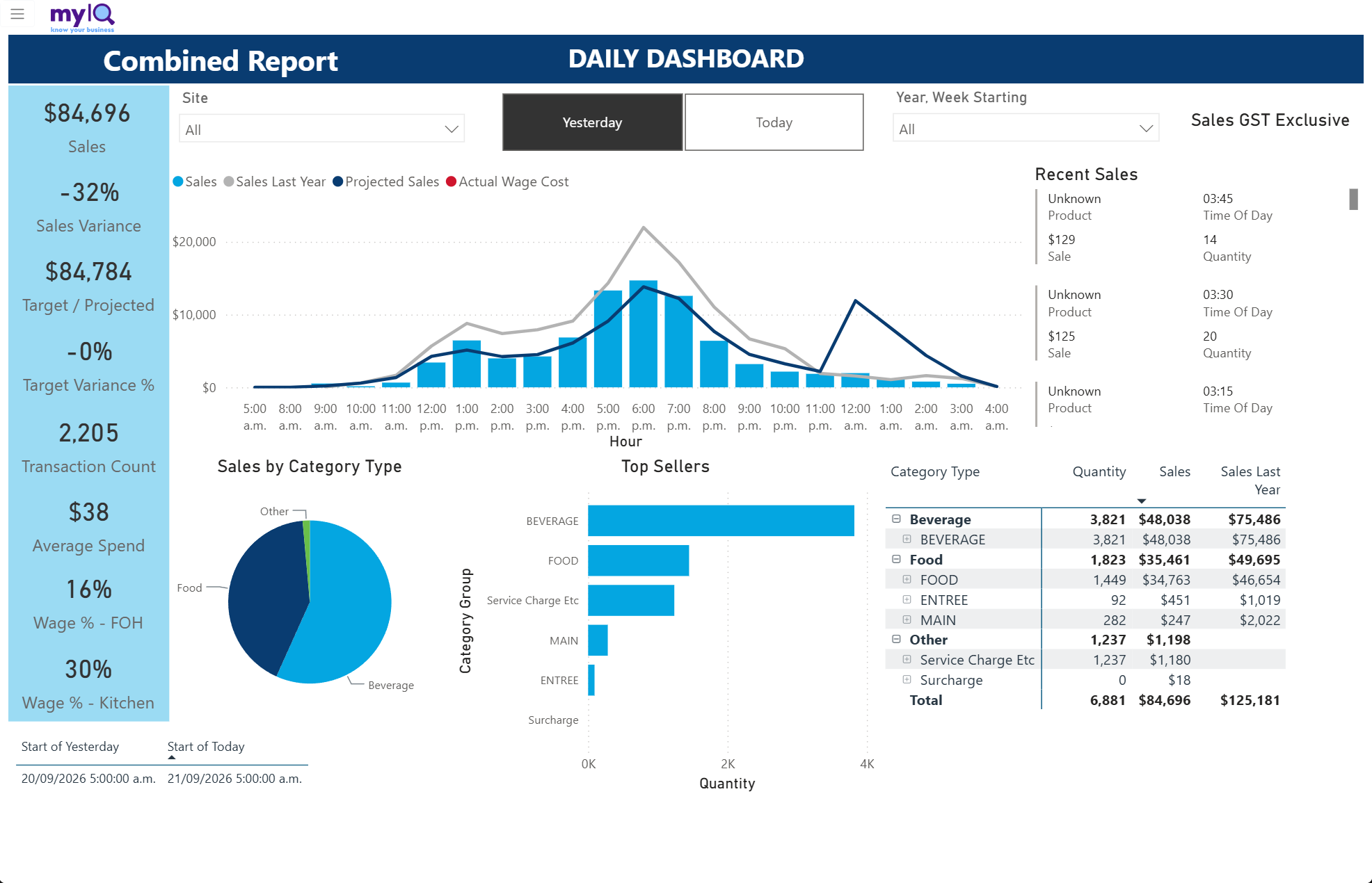
The Daily Dashboard — the page most users open first.
Filters: Site, Yesterday / Today, Year & Week Starting.
What is on the page
The KPI strip: Sales, Sales Variance against last year, Target / Projected, Target Variance %, Transaction Count, Average Spend, and wage percentage by department.
The Sales by Hour chart, with bars for this period’s sales and lines for Sales Last Year, Projected Sales and Actual Wage Cost.
The Recent Sales feed on the right, listing the latest transactions with product, time, value and quantity — this is live and updates through the day.
The Sales by Category Type pie and the Top Sellers bar chart.
The Category Type matrix, expandable from category down to product, with Quantity, Sales and Sales Last Year.
How to read it
The Sales by Hour chart is the shape of the day. Where the bars sit well below the grey Sales Last Year line, look at the hour rather than the total — a single bad service is a different problem from a generally quiet day.
The dark Projected Sales line is where the day was expected to land at the current trading rate. Bars tracking above it are a good day.
Click a slice of the pie to filter the whole page to that category — the KPI strip, the hourly chart and the matrix all follow.
Watch out for
On Today, everything after the current hour is empty and the totals are part-days. Compare like for like.
4.3 Weekly Dashboard
Answers: How is the week tracking against target and against last year?
Use it when: Mid-week to see whether you are on course, and at the end of the week to close it off.
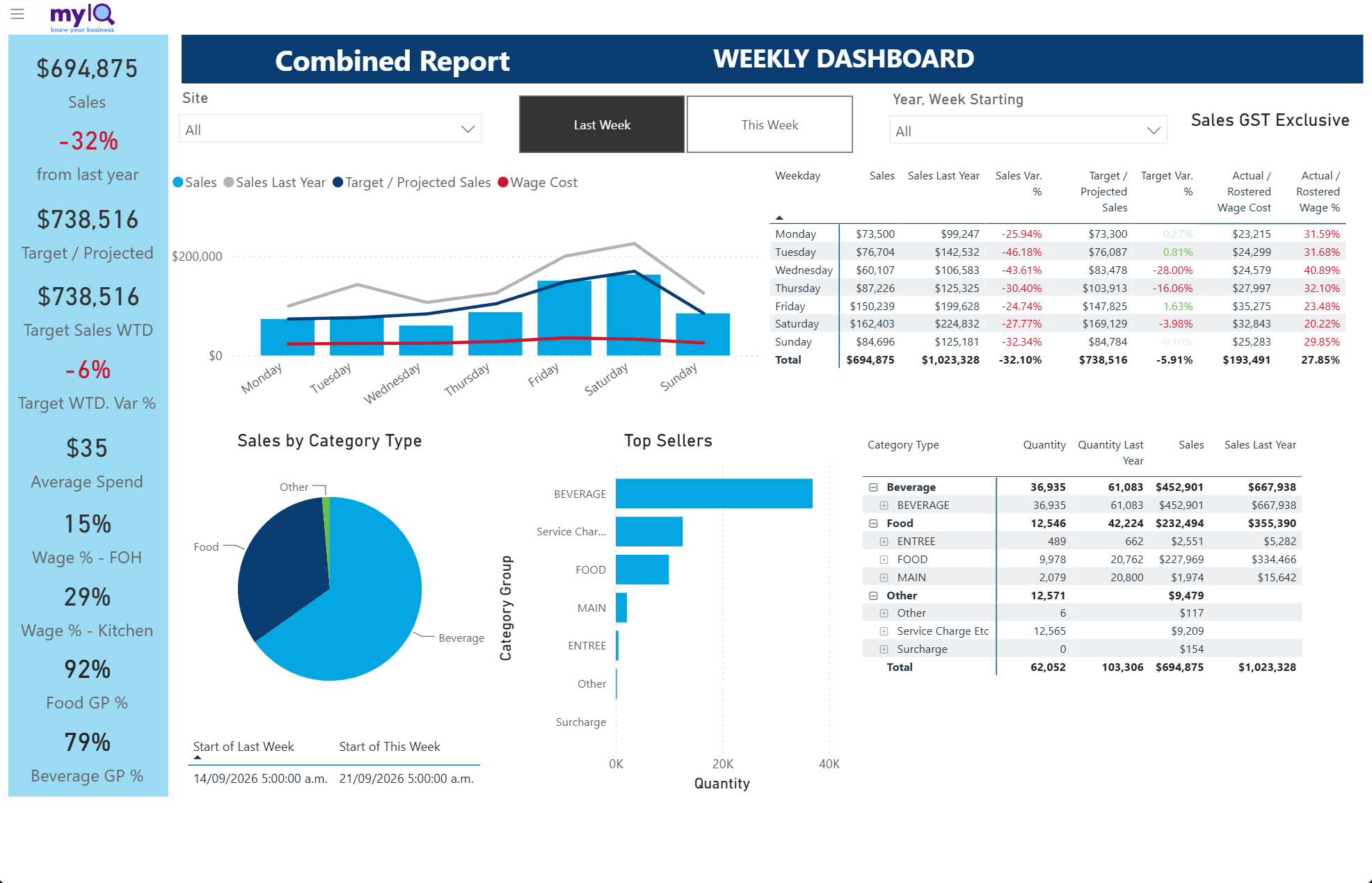
The Weekly Dashboard.
Filters: Site, Last Week / This Week, Year & Week Starting.
What is on the page
The same KPI strip as the Daily Dashboard, plus Target Sales WTD, Target WTD Var %, and gross profit percentages for Food and Beverage.
A combined chart of sales by weekday with last year, target and wage cost overlaid.
A weekday table with Sales, Sales Last Year, Sales Var %, Target / Projected Sales, Target Var %, Actual / Rostered Wage Cost and Actual / Rostered Wage %.
The category pie, Top Sellers, and a category matrix with quantities and sales for both years.
How to read it
The weekday table is the working view. Read down Sales Var % to find the days that hurt, then across to the wage columns on the same row to see whether labour was flexed to match.
WTD figures are week-to-date, so early in the week they cover only the days that have finished.
Watch out for
Wage figures on future days in the week are rostered, not actual — the column heading says "Actual / Rostered" because it switches from one to the other as days are worked.
4.4 Monthly Dashboard
Answers: How is the month tracking?
Use it when: Month-end reporting, and mid-month checks against budget.
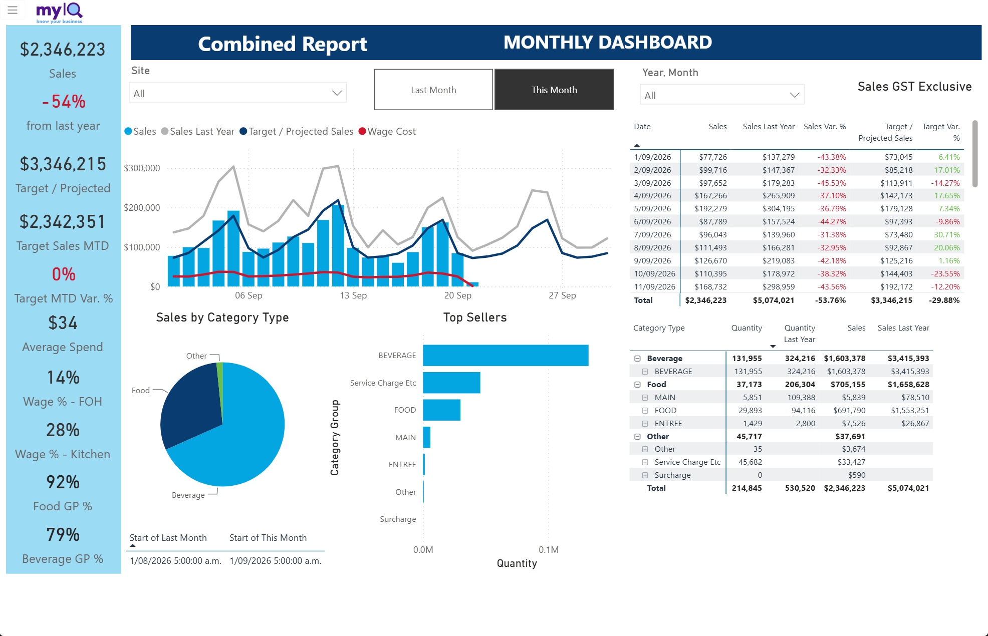
The Monthly Dashboard.
Filters: Site, Last Month / This Month, Year & Month.
What is on the page
The same layout as the Weekly Dashboard, with Target Sales MTD and Target MTD Var % in the KPI strip.
A daily chart across the month, with last year, target and wage cost lines.
A date-by-date table with Sales, Sales Last Year, Sales Var %, Target / Projected Sales and Target Var %.
Category pie, Top Sellers and the category matrix.
How to read it
Use the daily chart to spot pattern rather than level — the weekly rhythm of peaks should look similar to last year even when the level differs.
The Target Var % column is calculated per day, so a run of red days in the middle of a green month is worth investigating on its own.
4.5 Weekly Summary Dashboard
Answers: How did every site perform this week, side by side?
Use it when: Area and head-office review. This is the multi-site comparison view.
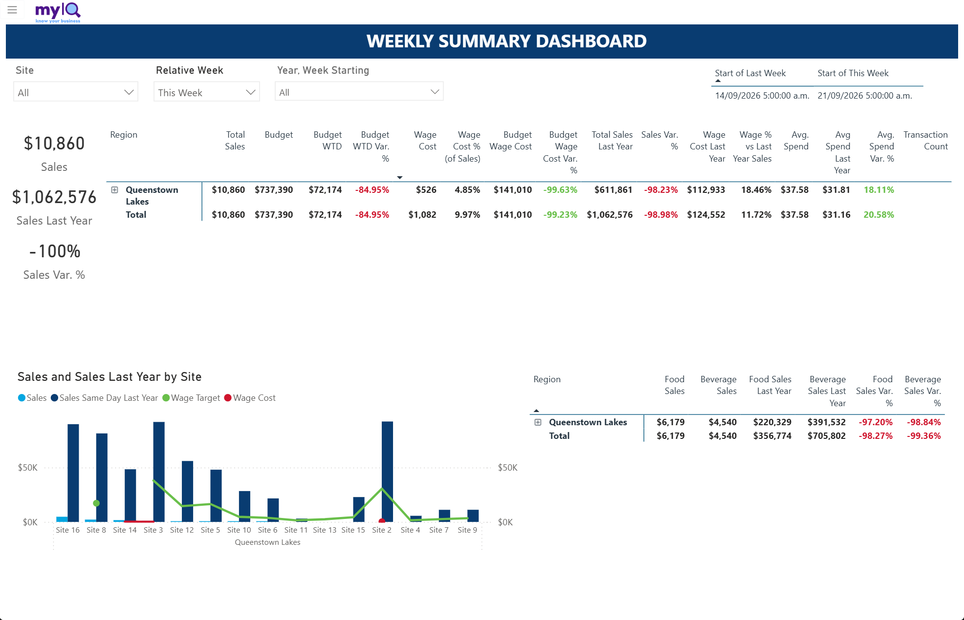
The Weekly Summary Dashboard — one row per region, expandable to site.
Filters: Site, Relative Week, Year & Week Starting.
What is on the page
A wide matrix grouped by Region. Click the plus box to expand a region into its sites.
Columns covering Total Sales, Budget, Budget WTD and its variance, Wage Cost and Wage Cost % of Sales, Budget Wage Cost and its variance, last year comparisons, Average Spend and its variance, and Transaction Count.
A Sales and Sales Last Year by Site column chart with Wage Target and Wage Cost overlaid.
A second matrix splitting Food and Beverage sales against last year.
How to read it
Sort the matrix by any column to rank sites — click the heading once for descending, again for ascending.
Read Sales Var % and Wage Cost % together. A site that is down on sales but has held its wage percentage has managed the week; one that is down on sales with wage percentage up has not.
The chart underneath is sorted by size, so the left-hand sites are your biggest contributors.
4.6 Monthly Summary Dashboard
Answers: How did every site perform this month, side by side?
Use it when: Monthly area and head-office review.
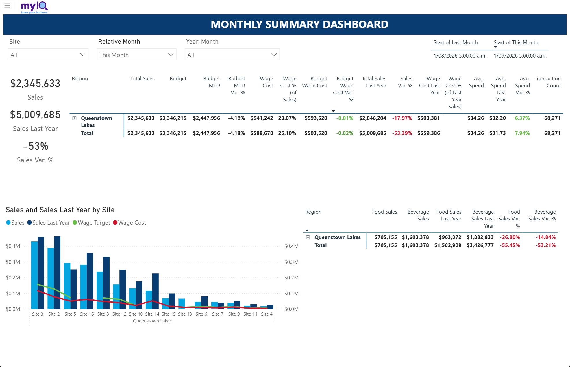
The Monthly Summary Dashboard.
Filters: Site, Relative Month, Year & Month.
What is on the page
The same structure as the Weekly Summary Dashboard, on a monthly basis, with Budget MTD in place of Budget WTD.
How to read it
Everything in 4.5 applies. Use the monthly version for board and owner reporting, and the weekly version for operational follow-up.
4.7 Weekly Summary GP Dashboard
Answers: Which sites are converting sales into gross profit, and which are not?
Use it when: When margin rather than revenue is the question.
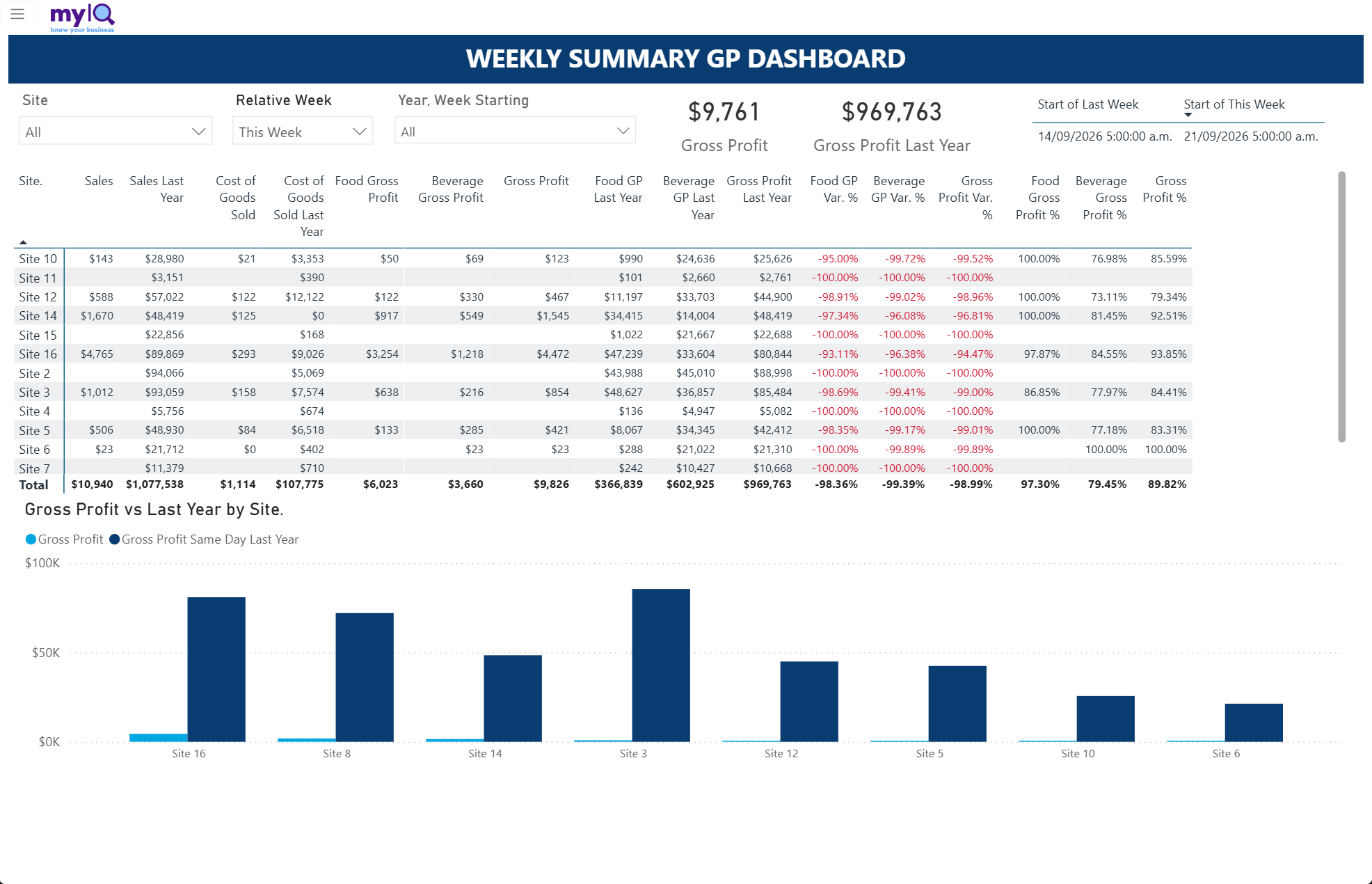
The Weekly Summary GP Dashboard.
Filters: Site, Relative Week, Year & Week Starting.
What is on the page
Cards for Gross Profit and Gross Profit Last Year.
A site-by-site matrix with Sales, Cost of Goods Sold, Food Gross Profit, Beverage Gross Profit and total Gross Profit, each against last year, with variance percentages and the gross profit percentages themselves.
A Gross Profit vs Last Year by Site column chart.
How to read it
The three percentage columns on the right — Food GP %, Beverage GP % and Gross Profit % — are the ones to scan. A site materially below its peers on beverage GP% is usually a pricing or wastage question; on food GP% it is usually purchasing or portioning.
Compare GP% against the group rather than against a fixed number. The right level differs by site type.
4.8 Weekly Profit & Loss
Answers: What did each site earn, spend and keep this week?
Use it when: Weekly trading review where you need revenue, margin and labour on one page.
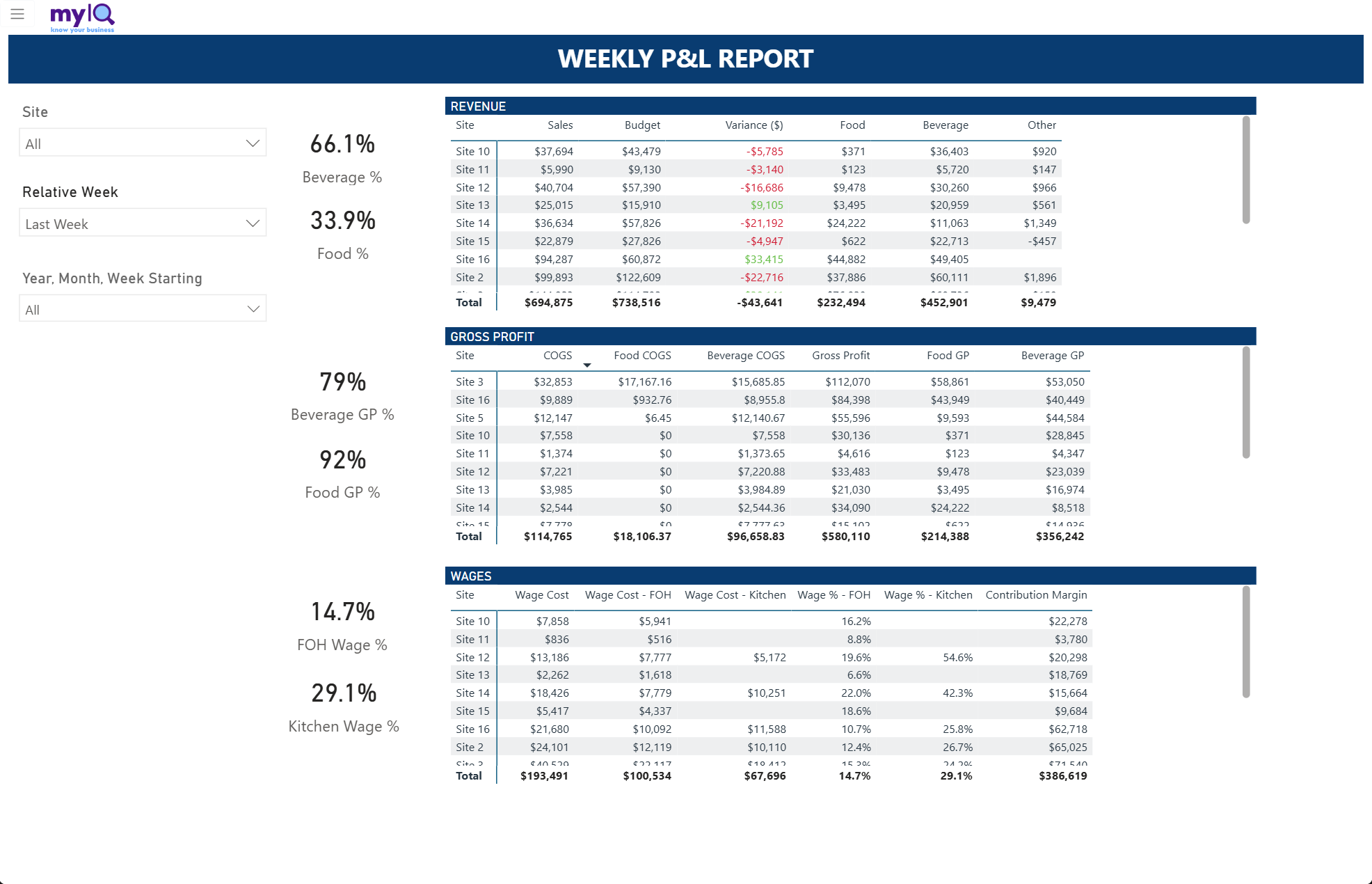
The Weekly P&L Report, with Revenue, Gross Profit and Wages stacked down the page.
Filters: Site, Relative Week, Year & Month & Week Starting.
What is on the page
A Revenue table: Sales against Budget with the dollar variance, split into Food, Beverage and Other.
A Gross Profit table: COGS split by food and beverage, then gross profit in total and by stream.
A Wages table: Wage Cost in total and by department, wage percentages by department, and Contribution Margin — gross profit after wages.
Cards down the left showing the mix (Beverage % and Food %), the margins (Beverage GP % and Food GP %) and the labour percentages (FOH Wage % and Kitchen Wage %).
How to read it
Contribution Margin is the number that matters most here — what the site actually contributed once the people who sold it were paid for. A site can look strong on sales and weak on contribution.
Each of the three tables scrolls independently. The Total row at the bottom of each always covers every site, not just the visible rows.
4.9 Sales by Category
Answers: What is selling, by category, and how does that compare with last year?
Use it when: Range and mix discussions.
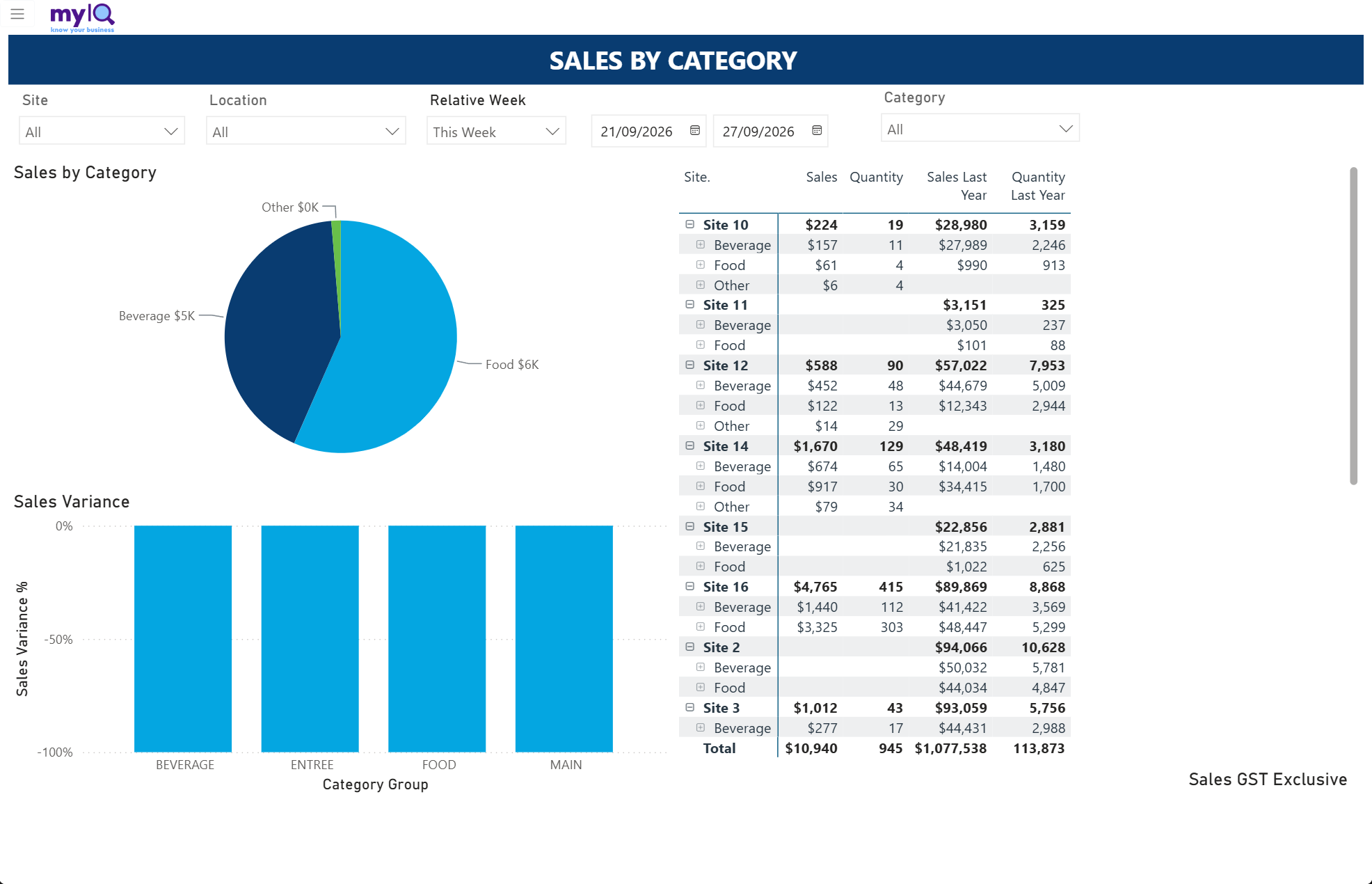
Sales by Category.
Filters: Site, Location, Relative Week with a date range, Category.
What is on the page
A Sales by Category pie.
A Sales Variance % column chart by category group.
A matrix grouped by site, expandable into category and then sub-category, with Sales, Quantity, Sales Last Year and Quantity Last Year.
How to read it
The variance chart is the fast read — it shows which category groups moved, not which are biggest.
Expand a site in the matrix to see whether a group-level movement is happening everywhere or is being driven by one location.
Compare Quantity against Sales. Quantity up with sales flat means price or mix has moved, not volume.
4.10 Highest Sellers
Answers: What are the top-selling lines, and are they growing?
Use it when: Range reviews, promotional planning, supplier conversations.
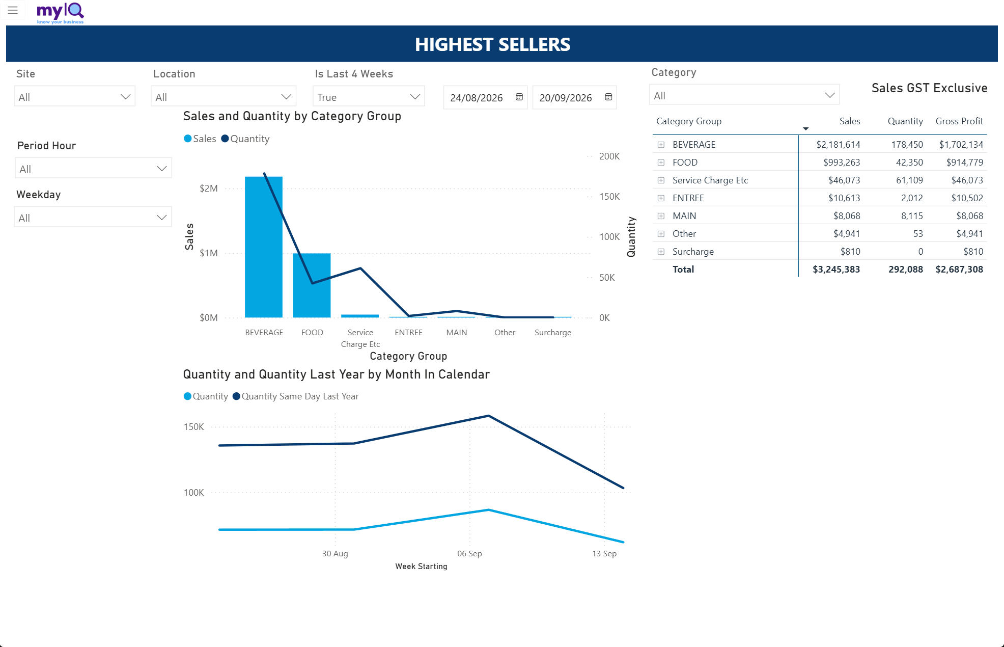
Highest Sellers.
Filters: Site, Location, Is Last 4 Weeks with a date range, Category, Period Hour, Weekday.
What is on the page
A Sales and Quantity by Category Group combination chart — bars for sales, a line for quantity.
A Quantity vs Quantity Last Year trend by week.
A matrix of category groups with Sales, Quantity and Gross Profit, expandable down to individual products.
How to read it
Where the quantity line and the sales bars diverge, price or mix is doing the work rather than volume.
Expand the matrix to product level and sort by Gross Profit rather than Sales — the biggest seller is not always the most profitable line.
The Period Hour and Weekday slicers let you ask narrower questions, such as what sells on Friday nights.
4.11 Sales vs Payments
Answers: Do the payments taken match the sales rung up?
Use it when: Daily or weekly reconciliation, and investigating a till discrepancy.
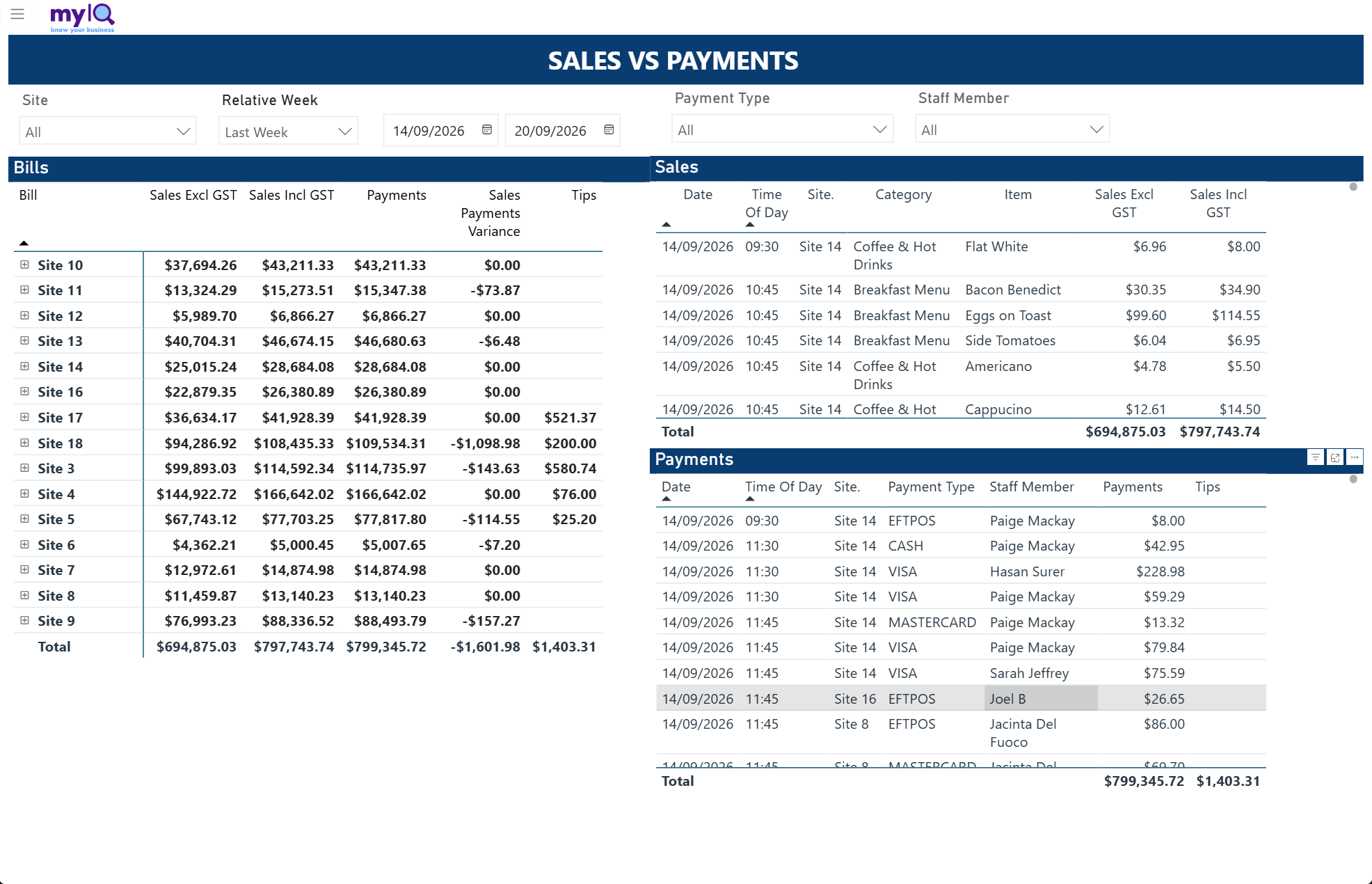
Sales vs Payments, showing the reconciliation by site with the supporting detail.
Filters: Site, Relative Week with a date range, Payment Type, Staff Member.
What is on the page
The Bills matrix on the left: Sales Excl GST, Sales Incl GST, Payments, Sales Payments Variance and Tips, by site and expandable to individual bills.
The Sales detail at the top right: every line with date, time, site, category, item and value.
The Payments detail at the bottom right: date, time, site, payment type, staff member, amount and tips.
How to read it
The column to scan is Sales Payments Variance. A zero means the site balanced. Anything else is worth a look, and the sign tells you which way.
Click a site row in the Bills matrix and both detail tables filter to it, which is how you find the transaction behind a variance.
Small variances are often rounding or tips; consistent variances at one site are usually a process issue.
Watch out for
This report defaults to the current week. On a Monday morning there is very little in it — switch Relative Week to Last Week.
4.12 Historic Sales
Answers: What does the long-run trading pattern look like?
Use it when: Seasonality, year-on-year trend, and setting expectations for a coming period.
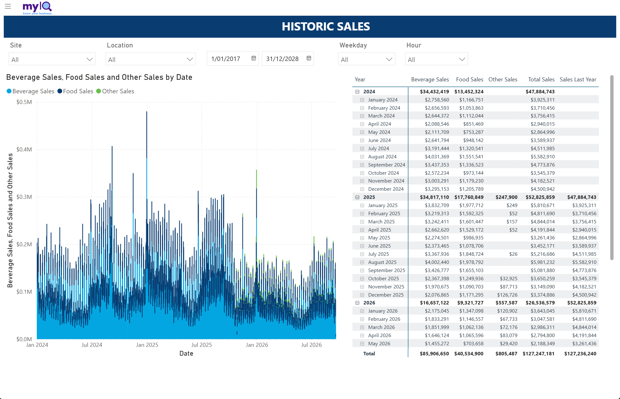
Historic Sales, showing several years of daily trading.
Filters: Site, Location, a date range, Weekday, Hour.
What is on the page
A daily column chart of Beverage, Food and Other sales across the whole selected range.
A matrix grouped by year and expandable into month and then day, with the same sales splits and totals.
How to read it
Narrow the date range before trying to read the chart in detail — several years of daily bars is a shape, not a set of readable values.
Use the Weekday and Hour slicers to answer trading-pattern questions: how Sundays have changed over three years, or whether the lunch trade has grown.
Collapse the matrix to years for the headline, then expand only the year you care about.
4.13 Discounts
Answers: How much is being discounted, under what reason codes, and by whom?
Use it when: Margin protection, and periodic checks that discount codes are being used as intended.
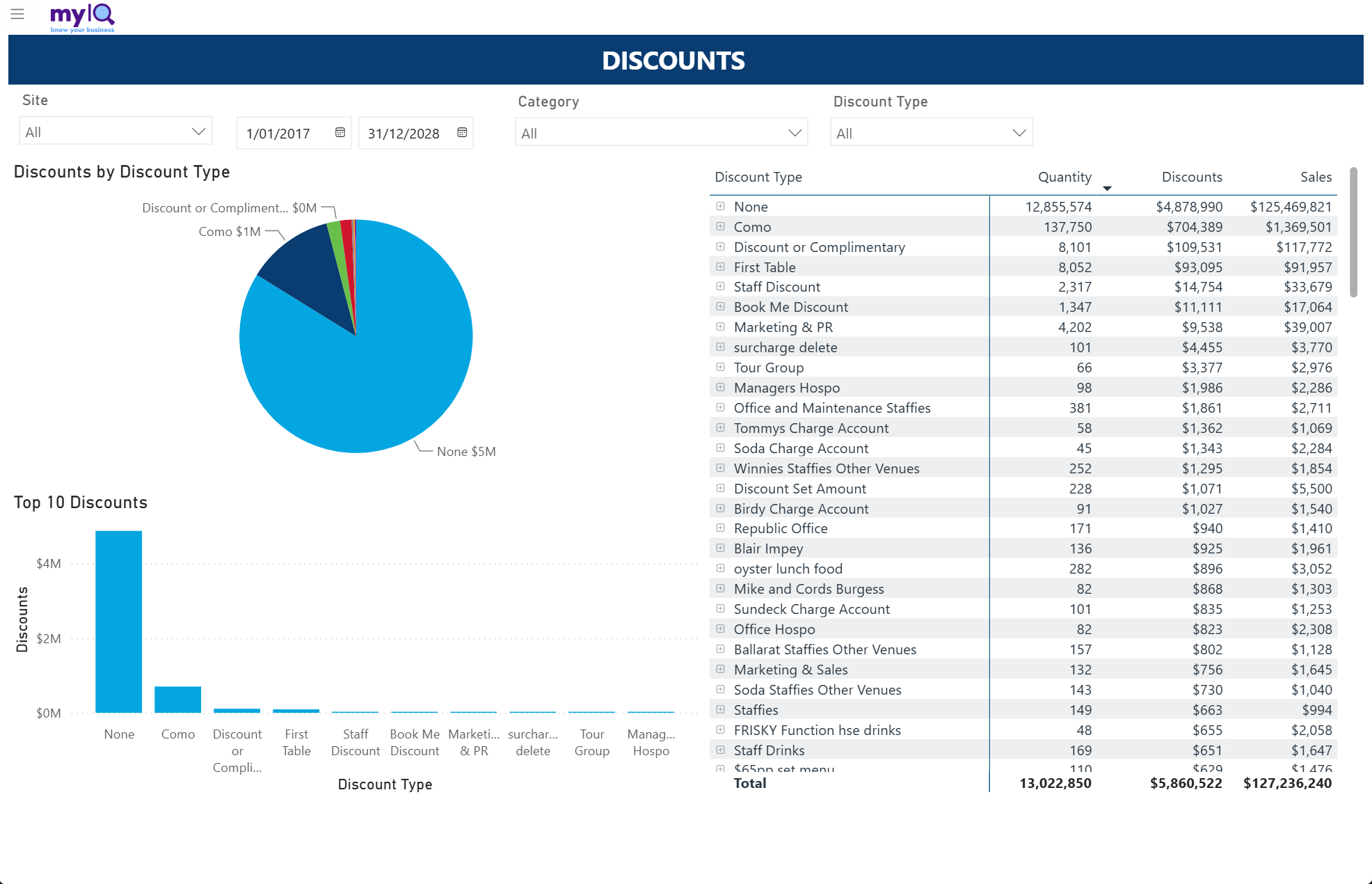
The Discounts report.
Filters: Site, a date range, Category, Discount Type.
What is on the page
A Discounts by Discount Type pie.
A Top 10 Discounts column chart.
A matrix of every discount type with Quantity, Discounts and the Sales those discounts sat against, expandable for detail.
How to read it
The None row is undiscounted trade, not a discount type. Read the rows below it.
Sort the matrix by Discounts descending to see where the money is going. Long tails of small staff and charge-account codes are normal; a single code growing quickly is not.
Compare Discounts against Sales on the same row — a code with a high discount-to-sales ratio is worth questioning even when the dollars are small.
Watch out for
Discount type names come straight from the point of sale, so misspellings and duplicates in the list reflect how codes were set up at the till.
4.14 Payments
Answers: How are customers paying?
Use it when: Banking, cash-handling reviews, and tracking the shift between payment methods.
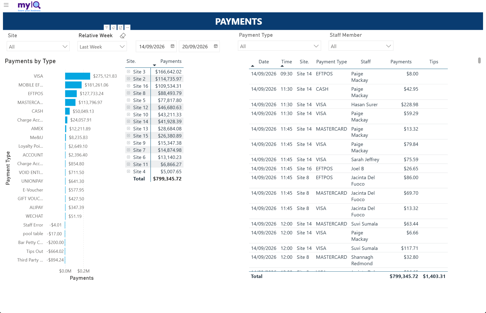
The Payments report.
Filters: Site, Relative Week with a date range, Payment Type, Staff Member.
What is on the page
A Payments by Type bar chart.
A matrix of payments by site.
A detail table with date, time, site, payment type, staff member, amount and tips.
How to read it
The bar chart is sorted by value, so the dominant methods are at the top.
Click a payment type to filter the site matrix and the detail table to it.
The Staff Member slicer makes this useful for cash-handling queries against a particular person or shift.
Watch out for
Like Sales vs Payments, this defaults to the current week. Switch to Last Week for a full set of figures.
4.15 Plan vs Actual
Answers: Are we hitting the plan, and what does the rest of the period look like?
Use it when: Budget reviews and forward planning.
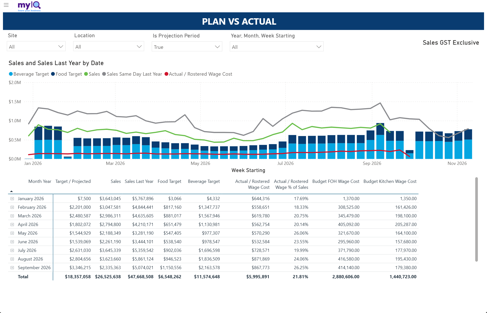
Plan vs Actual, with targets as columns and actuals as lines.
Filters: Site, Location, Is Projection Period, Year & Month & Week Starting.
What is on the page
A weekly chart with Food Target and Beverage Target as stacked columns, and Sales, Sales Same Day Last Year and Actual / Rostered Wage Cost as lines.
A month-by-month matrix with Target / Projected, Sales, Sales Last Year, the food and beverage target split, Actual / Rostered Wage Cost, Actual / Rostered Wage % of Sales, and the budget wage cost by department.
How to read it
The green Sales line against the stacked target columns is the plan-versus-actual read. Where the line sits inside the columns you are behind plan.
The red wage line should move with the sales line. A flat wage line under falling sales is the labour problem this report exists to surface.
The Is Projection Period slicer switches between the part of the period that has been traded and the part that is still projected.
4.16 Sales Analysis
Answers: When do we trade, and how has that changed?
Use it when: Rostering decisions, opening-hours reviews, and understanding the shape of demand.
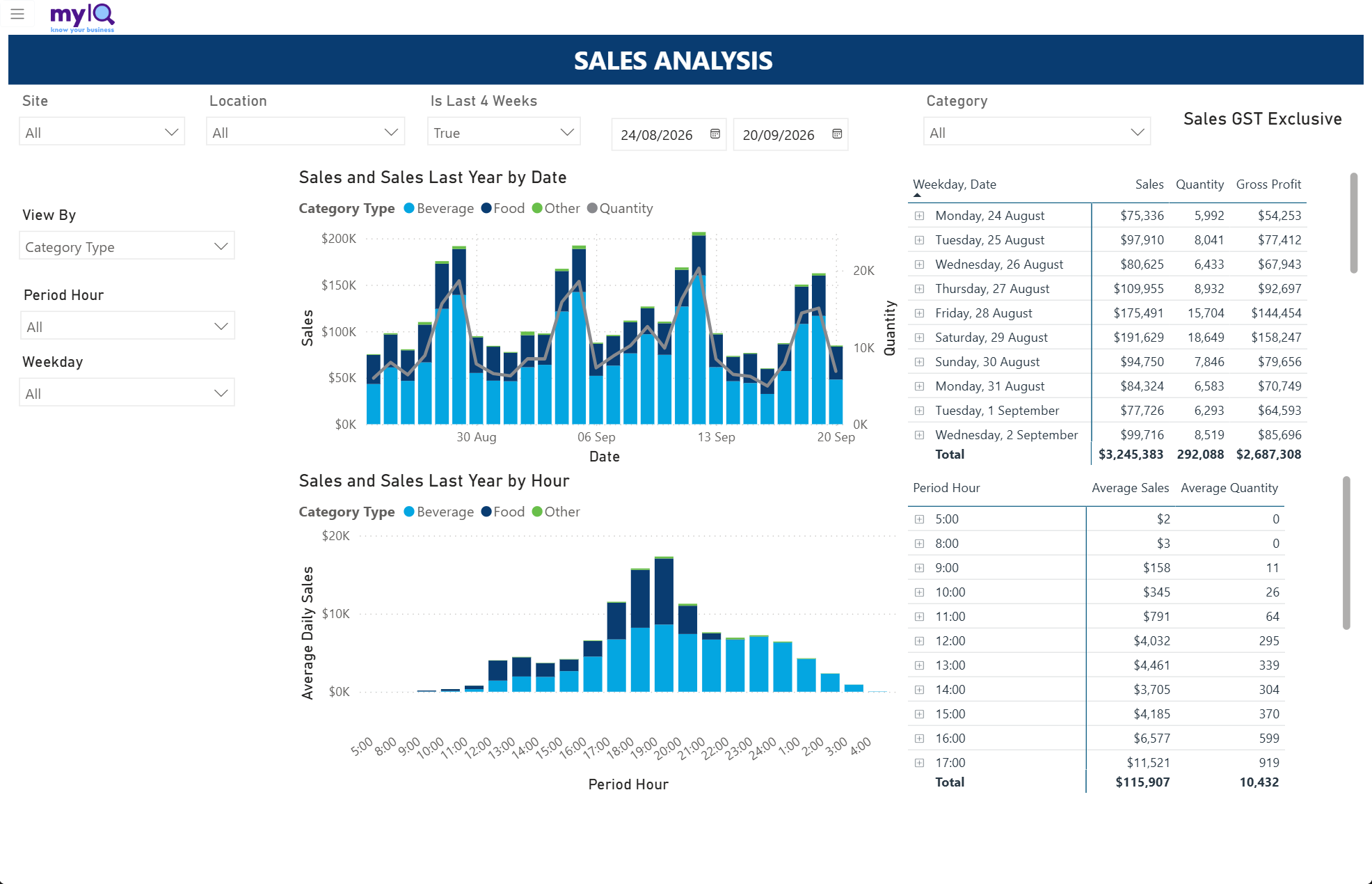
Sales Analysis.
Filters: Site, Location, Is Last 4 Weeks with a date range, Category, View By, Period Hour, Weekday.
What is on the page
Sales and Sales Last Year by Date, stacked by category type with a quantity line.
Sales and Sales Last Year by Hour — the average trading day, hour by hour.
A weekday-and-date matrix with Sales, Quantity and Gross Profit.
A Period Hour matrix with Average Sales and Average Quantity.
How to read it
The View By slicer changes what the charts are broken down by, so the same page can answer several different questions.
The hourly chart is the one to take into a rostering conversation. Read it alongside Hourly Wage Costs (section 5.4) to see whether your labour curve matches your sales curve.
Use the Weekday slicer to build the picture for a single day of the week rather than an all-days average.
4.17 Sales by Staff
Answers: How is each staff member performing on sales and average spend?
Use it when: Coaching conversations, upselling programmes, incentive tracking.
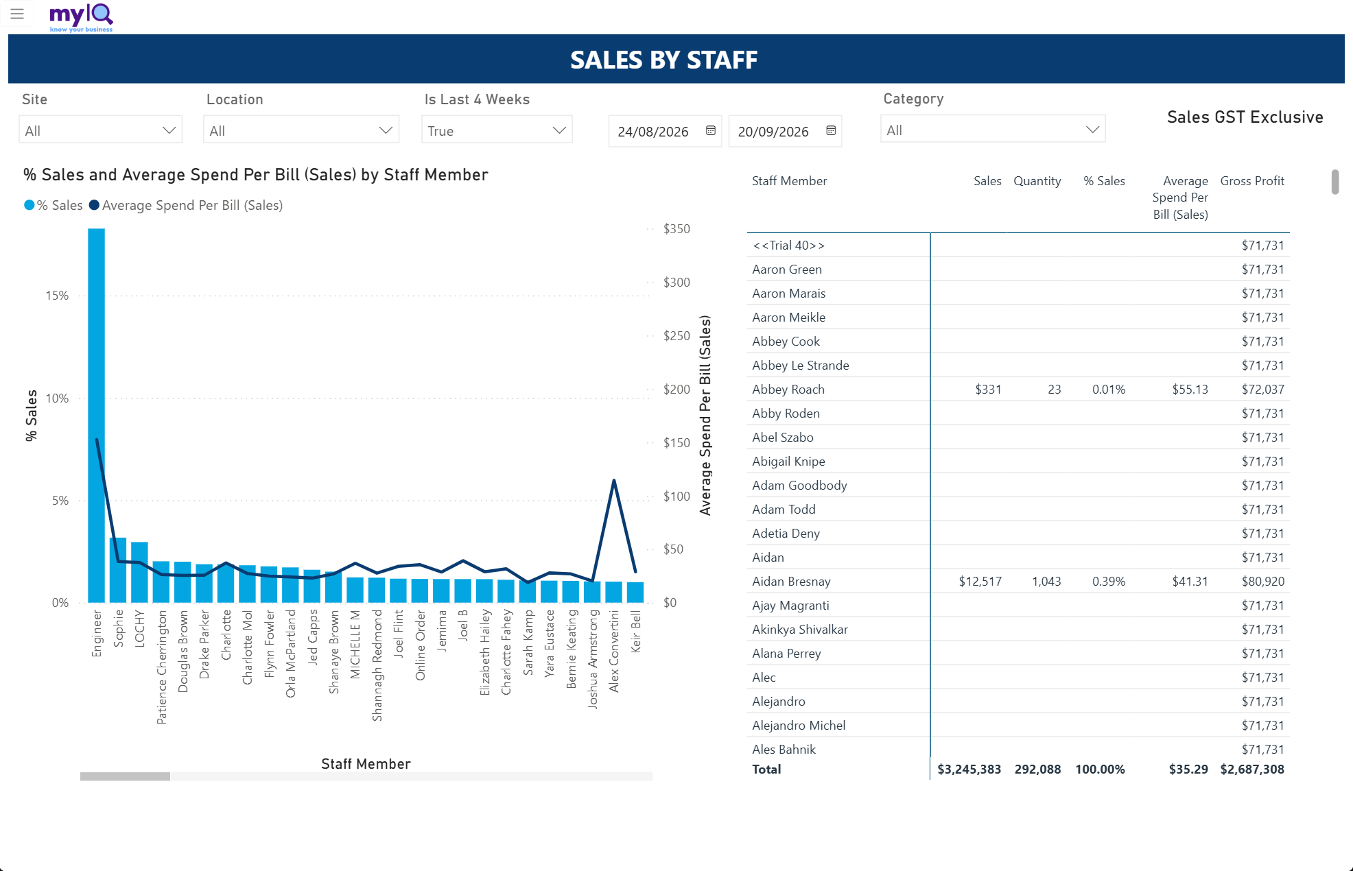
Sales by Staff.
Filters: Site, Location, Is Last 4 Weeks with a date range, Category.
What is on the page
A combination chart of % Sales as bars and Average Spend Per Bill as a line, by staff member.
A staff table with Sales, Quantity, % Sales, Average Spend Per Bill and Gross Profit.
How to read it
The interesting comparison is the line against the bars. A staff member with a modest share of sales but a high average spend per bill is upselling well; a high share with a low average is simply working the busy shifts.
Sort the table by Average Spend Per Bill rather than Sales to find your best upsellers.
Always read this alongside hours worked. Share of sales tracks roster as much as performance.